A convenient guide demonstrating how to easily customize the standard Bootstrap theme (colors, fonts, etc.) in your React app by leveraging Vite and Sass. Includes using of Google Fonts for your styling.
Table of Contents
Getting started – preconditions
In this article it is assumed that you have a basic knowledge on how to create a React app, integrate Bootstrap via npm and use Vite as the build environment.
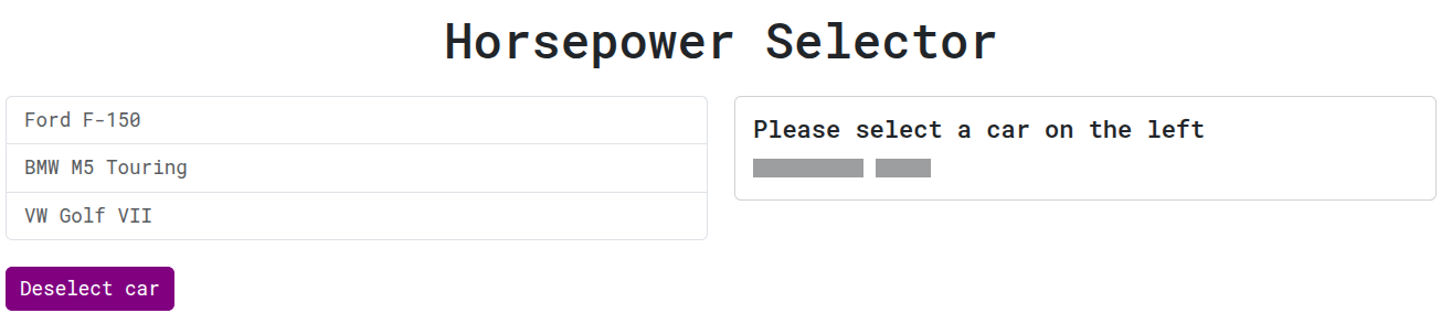
If you need a little help on that, just jump over to the React + TypeScript + Bootstrap with Vite guide. For convenience, we will use exactly the “Horsepower Selector” demo app described there as the starting point in this tutorial. You can get it from the GitHub repo.
Customizing Bootstrap using Sass
As Bootstrap and Vite are well prepared using and integrating Sass (Syntactically Awesome Stylesheets), the actual customization consists of three easy steps.
Create an scss file with your own styles
First, we’ll create a Sass file in the project using the modern SCSS syntax: src/scss/custom-bootstrap.scss.
That file mainly consists of three parts:
- Importing functions provided by Bootstrap (optional, but recommended)
- Define your own style mainly by setting Sass variables used by Bootstrap to your custom values. See
node_modules/bootstrap/scss/_variables.scssfor all available variables. - Import all the Rest of Bootstraps Sass. As Bootstrap uses Sass default-variables, your previous definitions take effect.
In our example, we will change the primary color to purple and increase the base font size. Here’s the final scss file:
@import "../../node_modules/bootstrap/scss/functions";

// custom styling placed between the bootstrap imports

$primary: purple;
$font-size-base: 1.2rem;

@import "../../node_modules/bootstrap/scss/bootstrap";
Refer to the Bootstrap Sass guide for a full description of customziation options in the scss file.
Change the Bootstrap CSS import
Next, locate the import of the Bootstrap CSS file and replace it with your own custom scss file. Mostly this would be in main.tsx of your React app. Vite provides built-in support for CSS preprocessors including Sass and will automatically compile the needed CSS out of the scss file.
//import 'bootstrap/dist/css/bootstrap.min.css';
import './scss/custom-bootstrap.scss';
Add the Sass compiler dependency
Finally, install a Sass compiler as development dependency in your project. Vite needs that to compile the custom Bootstrap CSS out of the custom scss file imported in the previous step.
npm i sass --save-devThat’s already it. Start your project by running npm run dev and see the customization in action.
Vite is also smart enough to detect any changes in the scss file: on saving, it will automatically re-compile the CSS and you can see the changes directly in your browser without any need of restarting the app.
Note: At the time of writing this article, Bootstrap 5.3.6 was the latest version. The provided scss files caused the latest sass compiler to throw many deprecation warnings although it was working. To workaround that and get rid of those warnings, you can install an older sass package, e.g. npm i sass@1.77.6 --save-dev worked fine.
Using Google Fonts
Customizing Bootstrap via Sass as described above makes it very easy to use Google Fonts in your own style. After choosing the desired font, click on Get font --> Get embed code --> Web and select the @import option.
For the font Roboto this would look like that:
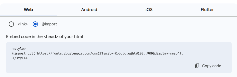
Just copy the @import statement and paste it into the scss file. Then use the Bootstrap Sass variable $font-family-base to set the new font.
@import "../../node_modules/bootstrap/scss/functions";

@import url('https://fonts.googleapis.com/css2?family=Roboto:wght@100..900&display=swap');

$primary: purple;
$font-family-base: "Roboto", sans-serif;
$font-size-base: 1.2rem;

@import "../../node_modules/bootstrap/scss/bootstrap";
Your base font now changed to Roboto.
A working example
The demo app repository contains the custom-bootstrap branch with a customization applied as described in this guide. To try it out simply clone the repo and start the branch version.
# git clone https://github.com/tsmx/horsepower-selector.git
# cd horsepower-selector
# git checkout custom-bootstrap
# npm install
# npm run dev
Visiting http://localhost:5173/ you can see the version with a customized Bootstrap.
Just for reference, you can switch back to the master branch reverting to the non-customized standard Bootstrap version.
# git checkout master
# npm run dev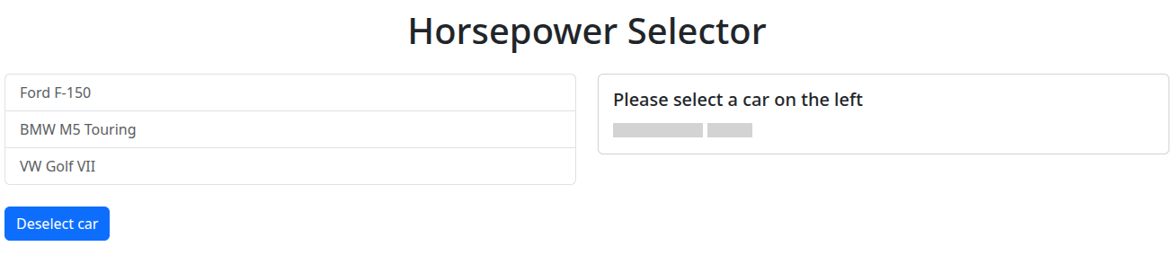
Happy coding 🙂